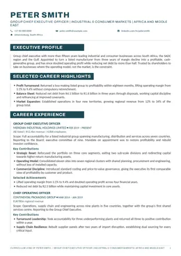
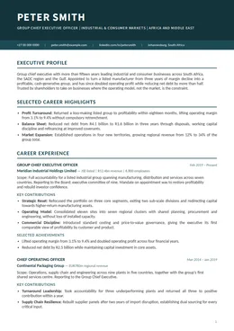
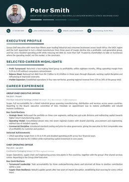
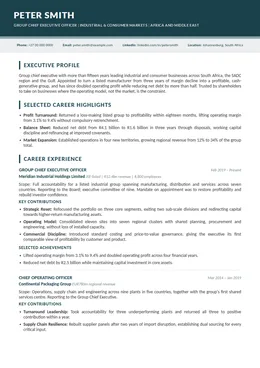
Fifteen designs, eight colourways. One house standard.
Every specimen below carries exactly the same words, the same structure and the same invented executive. Only the design changes, so what you are comparing is typography, weight and architecture rather than content. That wording is placeholder, written once to fill the page: these are design specimens, not samples of the writing. Each design is produced in eight colourways, so use the arrows on any specimen to step through the colours. Choose the design and the colour you want and we set your documents in both.
Fifteen designsEight colourwaysIdentical contentWith or without a photographDesign and colour chosen at intakeChange it any time before layout
How it works
Your design and colour are confirmed after you order, not before
Order the engagement or service you need. No design or colour decision is required at checkout.
Your intake questionnaire arrives. Two questions sit near the end, one for the design and one for the colour.
Choose both, or ask your consultant to choose for you based on your target market and career length.
Every document in your engagement is set in that design and that colour, so the set arrives as one piece of work.
Undecided at intake is not a problem. Tell us your target roles and markets and we will recommend a design and a colour.
Before You Choose
Four questions that narrow fifteen down to two or three
Most executives choose on instinct, and instinct is usually right. If you would rather reason it through, these are the variables that actually matter, and the filters above the range are built around them. Colour is a separate and much lighter decision, made after the design is settled, because all eight colourways are available on all fifteen.
i.
Photograph or none
Standard in much of Europe, the Middle East and Africa. Discouraged in the UK, the US, Canada and Australia. This single answer removes roughly half the range immediately.
ii.
Who reads it first
A search consultant, a board secretary and an automated screening system read very differently. Conservative sectors reward restraint. Where a system screens first, a single column parses most predictably.
iii.
How much career there is
Twenty-five years of operational scope needs a design that carries density without inflating the page count. A tighter, more recent career can afford air, and looks better with it.
iv.
What you want signalled
Design says something before a word is read. Establishment or momentum, institution or independence. Choose the signal that matches the room you are walking into, not the one you like best on screen.
The Range
Filter the range, step through the colours, select any design
The executive shown is invented and the content was written for this page. Employers are described rather than named, which is how client work is handled throughout the studio. Nothing here is drawn from a client engagement. Use the arrows on any specimen to move through its eight colourways, or set the whole range to one colour at once.
Narrow by
See the range in
Showing all 15 designs, each in eight colourways
Select a colour beneath any specimen, swipe it, or use its arrows, to see that design in another colourway. Every design can also be downloaded as a PDF and read at full size. Read them for layout, typography and structure only. The words inside are the same placeholder text in all fifteen and say nothing about how your own document would be written.
Deep Teal
01
Azure
Corporate and current
PhotographSingle columnContemporary
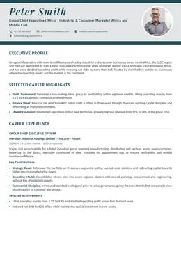
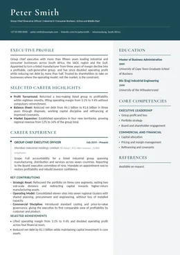
A full-width azure banner carries the name and the positioning headline, with the photograph set opposite. Below it the document runs in one clean column. Corporate without being stiff.
Best for
Executives in markets where a photograph is expected and a modern corporate register reads well.
Typically chosen in
Financial services, professional services, technology, consulting, Gulf and European markets
Automated screening
Strong. Single column beneath the header, with live text throughout.
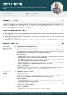
A serif name treatment set against a light field, the photograph placed quietly at the right, and section headings ruled in a single accent. Establishment tone with contemporary spacing.
Best for
Senior appointments where a photograph is customary and the tone must read as established rather than new.
Typically chosen in
Banking, insurance, legal, family office, board and advisory work
Automated screening
Strong. One reading column, real headings, nothing carried inside graphics.
A deep navy header block anchors the page, with the photograph set into it at the left and the contact line running beneath. The body is a single disciplined column. Formal, weighted, unambiguous.
Best for
Group and divisional leadership roles where the document should feel institutional at first glance.
Typically chosen in
Industrial, energy, mining, banking, state-owned and regulated enterprises
Automated screening
Strong. The header is styled text rather than an image. The body runs as one column.
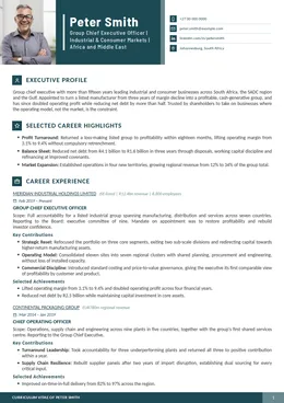
The photograph and the name share a two-part header block, and every section heading carries a small marker so a reader scanning at speed always knows where they are. Structure made visible.
Best for
Dense careers that need signposting, and readers who scan a document before they read it.
No colour at all. Solid black section bars, tight tracking and a name set in weight rather than size. The most severe document in the range and, in the right room, the most commanding.
Best for
Executives who want gravity without ornament, and documents that must print cleanly in black and white.
Typically chosen in
Private equity, law, audit, risk and restructuring, chair and non-executive mandates
Automated screening
Strong. Single column. The reversed bars are background styling, not images.
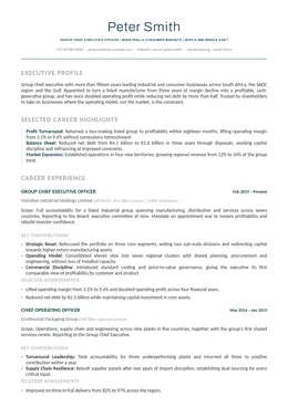
One accent band at the top, one column beneath, and nothing else. No panels, no markers, no ornament. The design gets out of the way so that the writing carries the entire argument.
Best for
Executives who want the document to read as substance first, and anyone genuinely unsure what to choose.
Typically chosen in
Every sector. The safe default where the market or the reader is unknown.
Automated screening
Strongest. Single column with no sidebars and no panels. The most predictable document here for automated parsing.
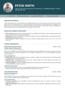
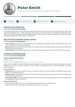
A deep navy field carries the photograph, the name and the contact icons in one composed header, and the body opens light beneath it. The most conventionally corporate document here, executed properly.
Best for
Large-organisation leadership roles in markets where a photograph is standard practice.
Typically chosen in
Corporate groups, consumer goods, telecoms, logistics, Middle East and European markets
Automated screening
Strong. Header text is live. Contact icons sit alongside readable text rather than in place of it.
A solid accent header, then section headings marked by a single vertical rule. Modern, linear and entirely free of ornament. Reads as current without ever asking for attention.
Best for
Markets where photographs are discouraged and the document still needs to feel contemporary.
Typically chosen in
Technology, digital, fintech, consulting, UK and US markets
Automated screening
Strongest. Single column throughout, no sidebar and no panels. Parses as predictably as anything in the range.
A serif name above a fine accent rule, with credentials carried in a narrow right-hand column so the main narrative runs uninterrupted. The design the studio reaches for when nothing argues for anything else.
Best for
Most executive briefs. The default where there is no strong reason to choose otherwise.
Typically chosen in
Industrial, energy, financial services, healthcare, general management
Automated screening
Reliable. The credentials column sits right, which some systems read after the main body. Live text throughout.
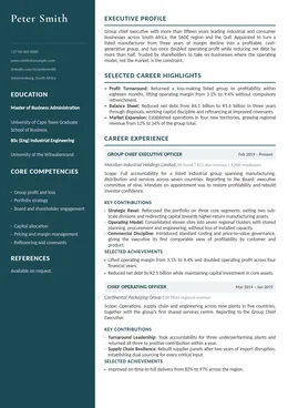
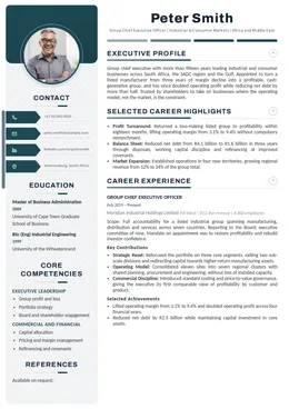
A dark reversed sidebar carries the contact details, education and competencies, leaving the main column free to run tight. Twenty-five years of evidence without inflating the page count.
Best for
Long tenures, technical and operational depth, and roles where the detail is the argument.
Typically chosen in
Engineering, mining and resources, manufacturing, supply chain, infrastructure
Automated screening
Recruiter-first. The reversed sidebar prints beautifully. Where automated screening dominates, Minimal or Whitehall is safer.
No dark bands anywhere. A centred serif name, hairline rules in a single accent and generous leading throughout. The quietest document in the range and the easiest on the eye.
Best for
Executives who want a modern, uncluttered read without a formal corporate register.
Typically chosen in
Consumer, marketing and brand, media, professional services, people and culture
Automated screening
Strongest. Single column, live text, a clean heading hierarchy and no graphic element carrying content.
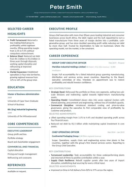
A deep navy header with the contact details set opposite the name, then a narrow left column carrying the career highlights alongside the main narrative. Engineered rather than decorated.
Best for
Executives who need to read as current, and careers where the headline achievements deserve their own column.
A full-height cobalt sidebar carries the photograph, the contact details, the education and the competencies, with the narrative running clear to its right. The most designed document in the range.
Best for
Markets where a photograph is expected and the reader wants credentials visible on the first page.
Typically chosen in
Gulf and Middle East, continental Europe, hospitality, consumer, commercial leadership
Automated screening
Recruiter-first. A full-height coloured sidebar is the least predictable structure for automated parsing, and the best for print.
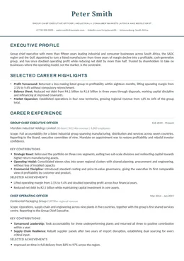
A centred serif name, a rule beneath it, and one column all the way down. No panels, no colour blocks and no photograph. The most conservative document in the range and, for certain rooms, the most persuasive.
Best for
Banking, law, insurance, actuarial, public sector and regulated governance roles.
Typically chosen in
Financial services, legal, risk and compliance, public sector, academia
Automated screening
Strongest. Single column throughout. The safest choice where a search process screens automatically.
A soft ivory field, the photograph set beside a bold name, and a contact strip that reads as a line rather than a block. Approachable without ever losing seniority.
Best for
Executives whose next appointment turns on relationships as much as on record.
Typically chosen in
Sales and commercial leadership, consumer, healthcare, non-profit, people and culture
Automated screening
Strong. Single column beneath the header. Contact icons accompany live text rather than replacing it.
Whichever you choose, the architecture is the same
Positioning headline rather than a job title. A two-paragraph executive profile. Four to six career highlights. Bold functional labels on every contribution. Grouped competencies rather than a flat list. Numbers carried in bold. That structure is the studio’s, and it does not change with the design.
Constants
What does not change with your choice
The design decides presentation. Everything below is house standard on every engagement, in every design.
The writing
Your positioning, profile, highlights and achievements are decided by strategy and writing. A design cannot rescue a weak argument and will not improve a strong one. The copy inside the specimens above is placeholder and is not ours to be judged on; your document is written from your own evidence.
Professionally written throughout
Every document is written by an experienced executive writer working from your intake questionnaire and your evidence.
Live, selectable text
No content is trapped inside an image in any design. Headings are real headings, so your document can be read, searched and parsed.
Word and PDF
You receive both formats. The PDF is what you send; the Word file is what you keep, so you can update it yourself later.
Market convention respected
UK, South African, US, European and Gulf conventions differ on photographs, personal details and length. Seven designs carry a photograph and eight do not, and your consultant will tell you which convention your target market follows.
Eight colourways, one per document
Every design is produced in the same eight. One accent colour runs through the whole document, which is what keeps an executive CV composed rather than decorated.
Questions
Choosing your design
When do I choose my design?
In your intake questionnaire, after you order. There are two questions near the end, one for the design and one for the colour, with a short note on each of the fifteen. If you would rather we chose, say so and your consultant selects the design and colour that best fit your target market and the length of your career.
Fifteen is a lot. How do I narrow it down?
Three answers remove most of them. Decide whether your target market expects a photograph, which takes the range to seven or to eight. Decide whether a single column or a two-column layout suits the density of your career. Then choose between a classic register and a contemporary one. Whatever is left, choose on instinct. If you would rather not, Minimal and Ascot are the two the studio recommends most often.
Should my CV carry a photograph?
It depends entirely on where you are applying. Photographs are standard in much of continental Europe, the Middle East and parts of Africa, and are actively discouraged in the United Kingdom, the United States, Canada and Australia, where they raise fair-hiring concerns and are sometimes stripped before a hiring manager sees the document. Seven designs here carry a photograph and eight do not. If you are applying across several markets, take a design without one and we can prepare a photographed variant for the markets that expect it.
Can I change my mind after I have chosen?
Yes. If you tell us before drafting is complete there is no cost and no delay. If your documents have already been laid out we will still move you, and it is treated as a revision rather than a new order.
Does the design change what is written?
No. Every specimen on this page carries exactly the same words, which is the point of showing them this way. Your positioning, your profile, your achievements and your structure are decided by the writing, not the layout. The design decides how that argument is presented.
Which designs are safest for applicant tracking systems?
Minimal, Whitehall, Linear and Lumen. All four run as a single column with no sidebar and no panels, which is what automated parsing handles most predictably. Every design in the range uses live text with a proper heading hierarchy and no content trapped inside images, so all fifteen parse. Atlas and Cobalt place a full-height sidebar alongside the narrative, which reads beautifully for a person and less predictably for a machine. If your search is running heavily through automated screening, tell your consultant at intake.
Which colour should I choose?
Every design comes in the same eight colourways, so the colour is a separate and much lighter decision than the design. Navy, Marine and Midnight are the most conservative and are the usual choice for banking, law, insurance and the public sector. Graphite and Black are the most neutral of the eight and are the safest if you expect your CV to be printed or photocopied in black and white, because they lose nothing. Teal and Azure read as the most contemporary and sit well in technology, consulting, media and consumer businesses. Deep Teal is the house default and is the one chosen most often. If you are undecided, leave the colour question blank in your intake and your consultant will set it to suit your target market.
Can I have a colour outside the eight?
The eight are what the studio produces and maintains, and they are chosen so that every one of them holds up in print, on screen and in greyscale. If your own professional brand runs on a particular colour, raise it with your consultant at intake and we will tell you honestly whether it can be accommodated without the document losing its composure. One accent colour family per document remains a house rule either way.
Will my cover letter match?
Yes. The cover letter, and every other document in your engagement, is set in the design you choose so that the set arrives as one piece of work.
Can I see a design at full size before I decide?
Yes, in two ways. Select any design on this page to open the specimen and step through the eight colourways while it is open, or download that design as a PDF and read it at full size, at print resolution, in your own time. Each design has its own accent colour in the downloadable PDF, chosen to suit that particular layout. The eight colourways are a separate choice, made at intake and applied to your own documents. The executive shown is invented and the content was written for this page, so what you are judging is the typography, the structure and the weight of the document rather than the words.
The CVs look great, and I would be suitably impressed to receive one from a job candidate.