
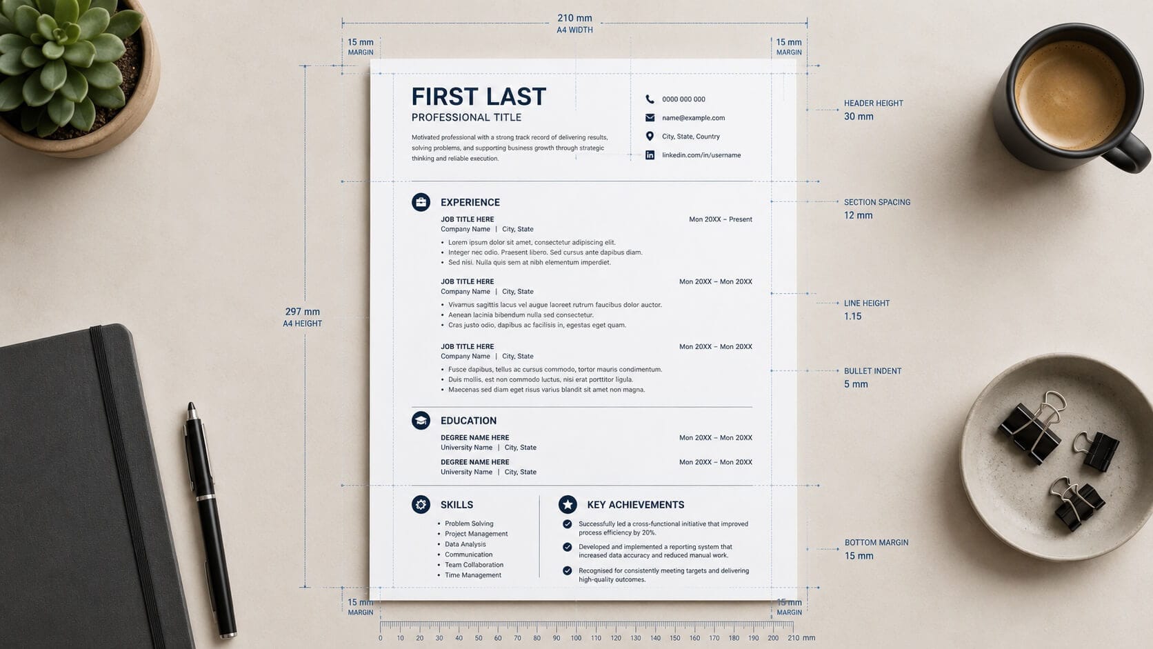
Your CV format decides whether a recruiter reads your achievements or bins them unread. Research from Ladders found that recruiters spend an average of just 7.4 seconds on an initial CV scan, which means layout, spacing and structure do a huge amount of work before a single word is judged. A clean, logical format signals professionalism; a cluttered one signals risk.
The good news is that formatting is entirely within your control. These nine rules cover everything from choosing the right structure to picking a file type that survives applicant tracking systems.
Table of Contents
The Three CV Format Types and When to Use Each
Before touching fonts or margins, choose the right overall CV format for your situation. There are three recognised structures, and picking the wrong one can bury your strongest selling points.
The reverse-chronological format lists your most recent role first and works for the vast majority of applicants. Recruiters expect it, and applicant tracking systems parse it reliably. If you have a steady work history in one field, use this.
The skills-based (functional) format leads with capabilities rather than job titles. It suits career changers and those returning to work after a break, though some recruiters view it with suspicion because it can hide employment gaps. The hybrid format combines both: a strong skills summary up top, followed by a chronological work history. For most people changing direction, the hybrid is the safer choice.
Rules 1 to 3: Fonts, Margins and Spacing
Rule 1: Use one professional font. Stick to a single, widely available typeface such as Calibri, Arial, Helvetica or Garamond. Set body text at 10.5 to 12 points and headings at 14 to 16 points. Decorative or script fonts undermine credibility instantly.
Rule 2: Keep margins between 1.5cm and 2.5cm. Shrinking margins to cram in more content makes the page feel dense and difficult to scan. If you are fighting for space, cut content rather than white space.
Rule 3: Use spacing deliberately. Set line spacing between 1.0 and 1.15, and leave a clear gap between sections. White space guides the eye to what matters. A recruiter should be able to find your current job title, employer and key achievements within seconds.
Rules 4 to 6: Section Order, Headings and Length
Rule 4: Order sections by relevance. The standard running order is contact details, professional profile, work experience, skills, education, then optional extras such as certifications. Recent graduates can move education above experience. The National Careers Service offers useful guidance on what each section should contain.
Rule 5: Use clear, conventional headings. Label sections “Work Experience”, not “My Journey”. Applicant tracking systems and time-pressed recruiters both rely on standard headings to navigate your document. Creative labels slow both of them down.
Rule 6: Keep it to two pages. For most UK professionals, two pages is the accepted standard. Senior candidates with long careers can summarise early roles in a single line each. For a full breakdown by career stage, see our guide on how long a CV should be.
Rules 7 to 9: File Type, ATS Safety and Consistency
Rule 7: Send a PDF unless told otherwise. A PDF preserves your layout on every device. Only submit a Word document when the job advert specifically requests one, as some older tracking systems handle .docx more reliably.
Rule 8: Keep the CV format ATS-safe. Avoid tables, text boxes, headers, footers, images and multi-column layouts. Tracking software often reads these elements out of order or skips them entirely, which can delete your contact details or scramble your work history. A single-column layout with standard headings is the safest structure.
Rule 9: Be ruthlessly consistent. If one job title is bold, every job title must be bold. Use the same date style throughout (for example, “Mar 2023 to Present”), the same bullet symbol, and the same alignment. Inconsistency reads as carelessness, and carelessness is the easiest reason to reject a candidate.
Formatting Mistakes That Send a CV to the Reject Pile
Even a strong CV format can be undone by a handful of common errors. Photos remain a mistake on UK CVs: they invite bias, waste space and confuse tracking systems. Ratings graphics for skills (five stars for Excel, four for teamwork) are equally unhelpful because they are unreadable to software and meaningless to humans.
Watch out for orphaned headings sitting alone at the bottom of a page, dense ten-line paragraphs where bullet points belong, and mixed fonts left over from copy-and-paste edits. Each one chips away at the professional impression you are trying to build.
If applications keep disappearing into silence, the layout may not be the only culprit. Cross-check your document against our list of the most common CV mistakes and read our advice on what to do when your CV is not getting interviews.
Formatting will never rescue weak content, but weak formatting will absolutely sink strong content. Get the structure right once, and every future application starts from a professional baseline. A polished CV format is the cheapest upgrade available to any job seeker: it costs nothing but attention to detail.
Get a Perfectly Formatted CV in Minutes
Smart CV Builder applies recruiter-approved, ATS-safe formatting automatically, so you can focus on your achievements instead of your margins.